How to make a device mockup that does not look fake.
Most of the work is in the screenshot, not the render. Here is the capture size for each device, the angle that reads as real, and the four things that give a mockup away.
Start with the screenshot, not the tool
The most common reason a mockup looks bad has nothing to do with lighting or angle. It is that the screenshot is the wrong shape for the screen it is going onto, so the tool crops it, and the crop takes the parts that carried the meaning.
Every device screen has a fixed aspect. Fit modes generally default to
cover, which fills the glass and discards the overflow, because the
alternative is letterbox bars inside a device screen and those look worse than any
crop. So the fix is upstream: capture at roughly the right shape in the first place.
Capture sizes for each device
These are the actual screen aspects used by this tool. Anything close to them will lose only a few percent to cropping.
| Device | Screen aspect | Capture at |
|---|---|---|
| iPhone 17 Pro Max | 1 : 2.164 portrait | 430 x 930 |
| iPad Pro | 1 : 1.323 portrait | 1040 x 1375 |
| MacBook Pro 16 | 1.534 : 1 landscape | 1600 x 1043 |
| Pro Display XDR | 1.743 : 1 landscape | 1600 x 918 |
| Apple Watch Ultra 2 | 1 : 1.219 portrait | 410 x 500 |
The two that catch people out are the tablet and the phone, and they catch them in opposite directions. A desktop grab on a phone becomes a narrow vertical slice out of the middle. A desktop grab on the iPad keeps a centre band and loses both sides, which usually takes the navigation with it.
Clean the page before you shoot
Floating widgets bake into the render and are miserable to remove afterwards. Before you capture, get rid of:
- Cookie banners and consent pills
- Chat bubbles and "Call now" buttons
- reCAPTCHA badges, which sit bottom-right on almost every form page
- Carousel arrows and any hover state you left open
Scroll to the top as well. A header that is halfway up the frame reads as a mistake even when the viewer cannot say why.
The angle
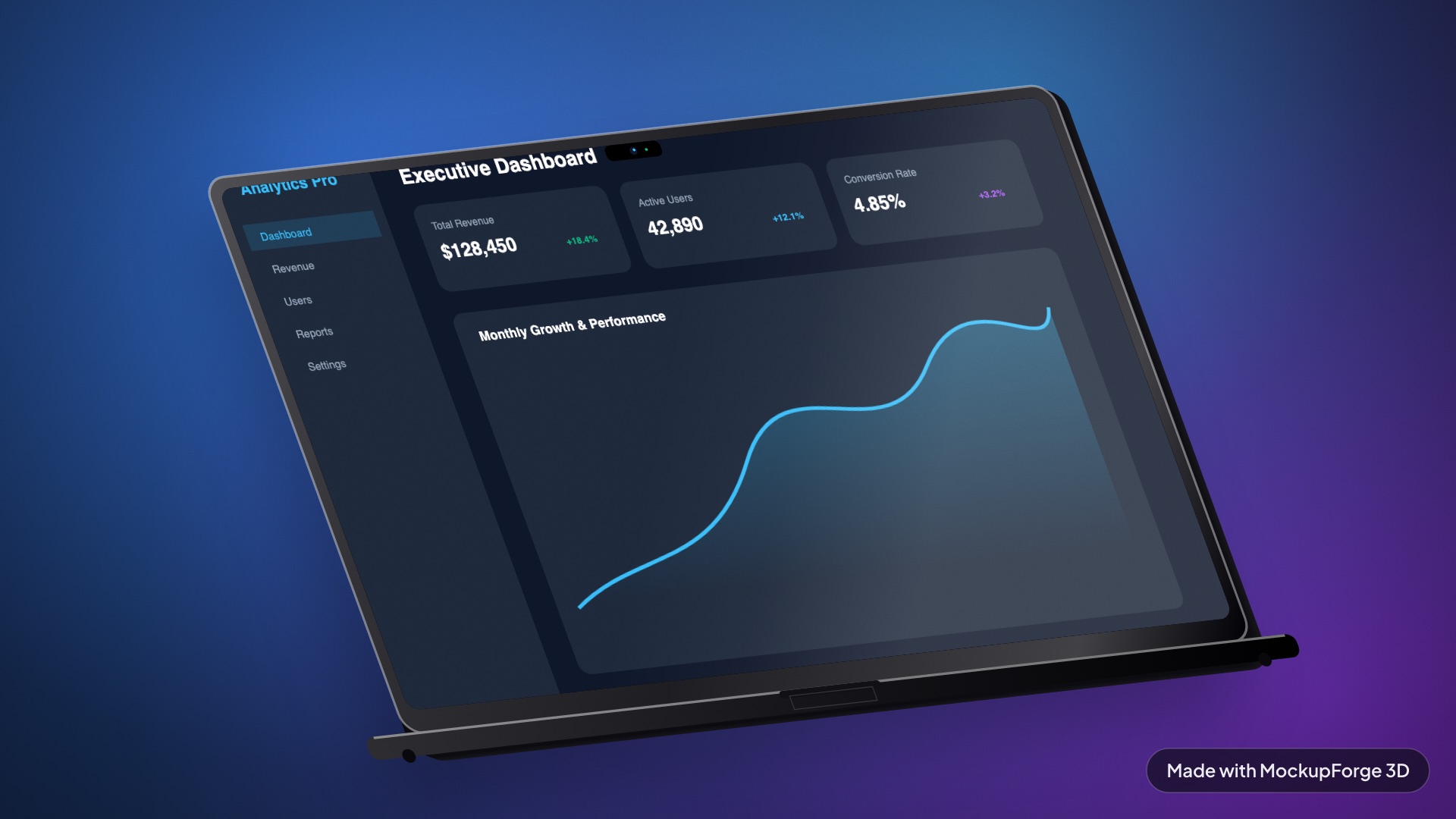
A small rotation reads as intentional. A large one reads as a template. Something in the region of 15 to 25 degrees of yaw with a few degrees of pitch is usually enough to show the device is a solid object without turning the screenshot into a sliver.
The test is whether the content is still readable. The whole point of a device mockup is to show the interface. If the angle has made the text illegible, the mockup is now decoration and you would be better off with a flat screenshot.
What actually makes a render look fake
Four things, roughly in the order they get noticed.
The shadow is wrong
A single directional light produces one uniform-density shadow at any distance, which is not how contact works. Real objects darken sharply where they touch a surface and soften as they lift away from it. Without a contact shadow at the footprint the device reads as floating, even when everything else is right.
There is no environment
Dark metallic bodies lit by two flat lights render as a near-black silhouette with no visible edges. What fixes it is image-based lighting: an environment map the material can reflect. This is the difference between "3D" and "photoreal", and it is usually mistaken for a geometry problem.
The screen is too bright and too clean
A screen behind glass is never a flat paste of the original pixels. A little glare and a little grain does more for believability than any amount of extra polygons. Too much of either and you have gone the other way, and the interface stops being readable.
The screenshot is stretched
Subtle and easy to miss. If the device's texture mapping is not linear, part of your screenshot is compressed and part is stretched, and the eye reads it as "off" without identifying why. Test it with a ruler image, coloured bars at known percentages, rather than a single square: one square samples one place and cannot detect a non-uniform distortion at all. The MacBook page has a worked example of exactly this fault.
Then export at the size you actually need
Export at 2x for anything going on a website and 4x for print or a case study PDF. A 4x export here is 7680 by 4320. Exporting larger than you need is not free: it costs several seconds of encoding and produces files in the tens of megabytes.
If you are producing a set, build the look once and save it. Applying a saved look to the next screenshot is what keeps a row of App Store shots consistent, and it is the difference between a batch that looks designed and a batch that looks assembled.